Summary:
Some of the charts on the weekly update report have been cleaned up a bit. In particular, the charts which display time periods on the X-axis will no longer show straggling single counts in periods before Dec’ 2020 (such anomalous records were a result of incorrect VAERS data, as these products were not available prior to Dec’ 2020). In essence, the faulty data has been “cleaned” up a bit.
This affects the following charts:
- Cumulative Reported Deaths After Vaccination – 1 Year Summary
- Reported Deaths by Week, COVID19 Vaccines
- Reported Deaths by Year, COVID19 vs. All Other Vaccines
- Reported Deaths by Year, COVID19 vs. All Other Vaccines, Cumulatively
- Reported Deaths Daily vs. Doses Administered for COVID19 Vaccines
- Cumulative Reported AEs After Vaccination – 1 Year Summary
- Reported AEs by Year, COVID19 vs. All Other Vaccines
- Reported Adverse Events Daily, COVID19 Vaccines vs. Doses Administered
- Reported Deaths by Year, COVID19 vs. Flu Vaccines
Also, one other correction is that for the Deaths per Million Doses (US Only) Traditional Vaccines (2006-2019), COVID-19 Vaccines (2020-Present) chart, where the individual vaccines for Measles, Mumps and Rubella have been removed. This is justified by the fact that the sample size for these three are 2-3 orders of magnitude less than all the other vaccines in this chart. This is the same change that was already implemented to the chart in a post a while ago here: https://vaersanalysis.info/2021/08/12/annualized-deaths-per-million-doses-traditional-vaccines-vs-covid-19-vaccines/
The Long Explanation:
Although the charts now look cleaner, the data was not in fact altered in any way. In general, I am not a fan of altering or correcting the CDC’s crappy data in any way. It is their responsibility to correct and clean up their data, not mine. So rather than altering their data, the “correction” that was actually made was to make the underlying data retrieval queries more “intelligent”. Previously, records were being assigned a date based on choosing the first non-null date value found in the following four fields in sequential order: DateDied (date of death), VAX_Date (date of vaccination), Onset_Date (date of the onset of vax injury), RecvDate (date of receipt by VAERS or date of entry into VAERS). [If you are familiar with the SQL language, this is the COALESCE function]. This works great for the most part, as doing it this way allows us to retrieve more records than if we chose to focus on filtering results using only one of the four fields. However, there are currently about 15 death records (and hundreds of non-death AE records) for which this is problematic, as illustrated below:
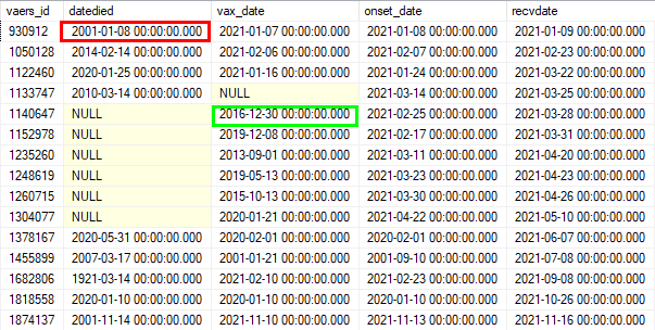
Taking the 1st row (ID: 930912) as an example, the first non-null date value is the datedied field, which as we can see is in 2001. Given that the Covid shots were not administered until Dec’ 2020, obviously this date is incorrect. Similarly, for the 5th row (ID: 1140647), the first non-null date value is going to be the vax_date, which is in 2016 and is also an incorrect date.
So while the new implementation works very similarly, it is now more intelligent in that it will exclude dates earlier than Dec’ 2020. So the new query will return a date of 1/7/21 for the 1st row, and 2/25/21 for the 5th row. Much better right? And now the charts look cleaner too (assuming any of you actually cared).
And perhaps the most important takeaway is this: if the CDC’s VAERS staff even bothered to do a minimally semi-competent job of cleaning up their records, none of these extra mental gymnastics would even be necessary…There is absolutely no excuse for such shoddy quality control of their data (refer to this post also). If the VAERS database was an enterprise-level system used in the retail industry to keep track of sales of say widgets or something like that, the database administrator (or whoever is in charge of the data) would have been fired a long time ago. What would your response be if you were the CEO of this widget company and you asked your data person to provide you a report of how many red widgets sold last month, and the answer you got was: “Gee, I’m not sure sir, maybe 10,500… plus or minus 250… and actually I think the blue ones got mixed up with the red ones”?
Love the work you are doing on this site. No idea how I found your page but so glad that I did. Is there a discussion forum where VAERS reports can be discussed in detail?
Also, could you please do a quick intro post one of these days? Do you work in data analytics, or is this a side project? Do you have any relevant education or work experience that would add credibility to your site? (Polite way of saying: Why should we trust you?) Are you in USA?
Would also be cool if you made a post describing your computer setup, what programs/tools you use to access VAERS,
any recommended govt websites or public data sources, & maybe any other bloggers or YT’ers who you follow for VAERS updates.
Thanks so much!
[…] for this week: Some charts have been “tidied” up. See post here for […]