Mr. Craig Paardekooper has done some very extensive data analysis with regards to the VAERS lot numbers. The work is fairly comprehensive and quite compelling. If you haven’t seen it, head over to his site at: https://www.howbad.info/. He also maintains a convenient batch (lot number) look-up tool which allows you to type in any lot number and see how much harm has been associated with that batch according to VAERS. In this post, we will highlight, summarize, and verify a couple of the key findings that he has painstakingly provided for the world to see.
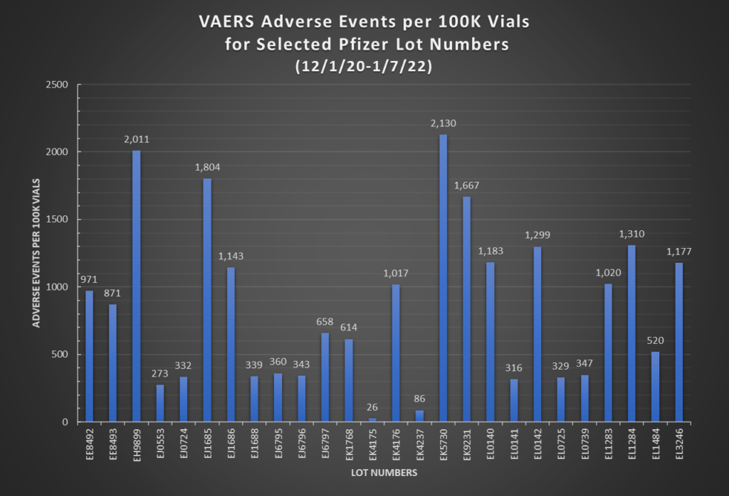
In Part I of the Hot Lots Update post, it was mentioned that we cannot come to any hard conclusions about hot lots without knowing for certain the quantity manufactured in each lot. However, this has changed, at least in part, since Mr. Paardekooper has made known a Pfizer document which includes the number of vials manufactured for each of a list of 33 Pfizer lots: https://www.howbad.info/lotsizes.pdf (starting on page 23). In this document it appears that the lot quantity ranges from 19,010 at the low end to 304869 on the high end, so the widest difference in lot sizes is a factor of 16x. Taking this into account, and if we were to assume most lots are being produced in the same manner, we would conclude that the number of adverse events or deaths should not differ by substantially more than 16x between the lot with the lowest number of events and the lot with the highest.
So is this what we find? No. Based on the charts below, the range of adverse event rates between the lowest and highest lots is 26 vs. 2130 (rate per 100K vials) for a factor of 82x. For death rates, the range is 1 vs. 52 (rate per 100K vials), for a factor of 52x. So therefore, we can conclude that lot size differences are not the driving factor for why there are certain lots producing substantially more adverse events than others. If the lots were being manufactured with consistent quality, we would not be seeing such wide variations in associated harm/death rates from lot to lot.

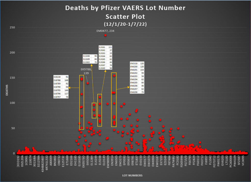
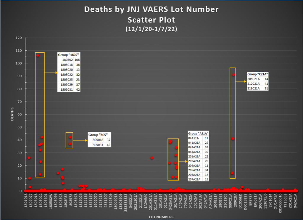
We can also create scatter plots to visualize the distribution of adverse events and deaths across all the lot numbers. The first chart below is a scatter plot showing number of deaths associated with each lot number, with each point on the chart representing one particular lot number. For example, the chart shows that lot number EM0477, which is the biggest outlier, has 234 deaths associated with it. The vast majority of the points on the charts are at or near 0, meaning there are few or no deaths associated with those lots. There is a small proportion of points that sit between 0 and 50 deaths. There is an even smaller proportion that sits between 50 and 100 deaths. Finally, there are even fewer lots that actually reside above the 100 deaths level.
However, what is most interesting about this chart is that there appears to be a noticeable pattern whereby the lots associated with the highest number of deaths seem to be organized into groups. Four of these groups are highlighted on the chart below, and it is evident that you can essentially draw a straight vertical line between the points in each group. What this means is that each point in the group has a lot number that starts with the same first two letters. For example, in the leftmost highlighted group, all the lot numbers begin with “EJ”. You will notice that in many instances, the lot numbers are also sequentially numbered (eg. EJ6788, EJ6789, EJ6790). The rightmost highlighted group, the “EN” group, even has an unbroken sequence of 9 consecutive lot numbers (EN6200 through EN6208). This is in essence a very strong sign of non-randomness. Make of this what you will, but if the lots were truly randomly distributed, you would not expect to be able to see so many multiple vertical lines which clearly show “organization”, especially for numbers of deaths above 50 or so.
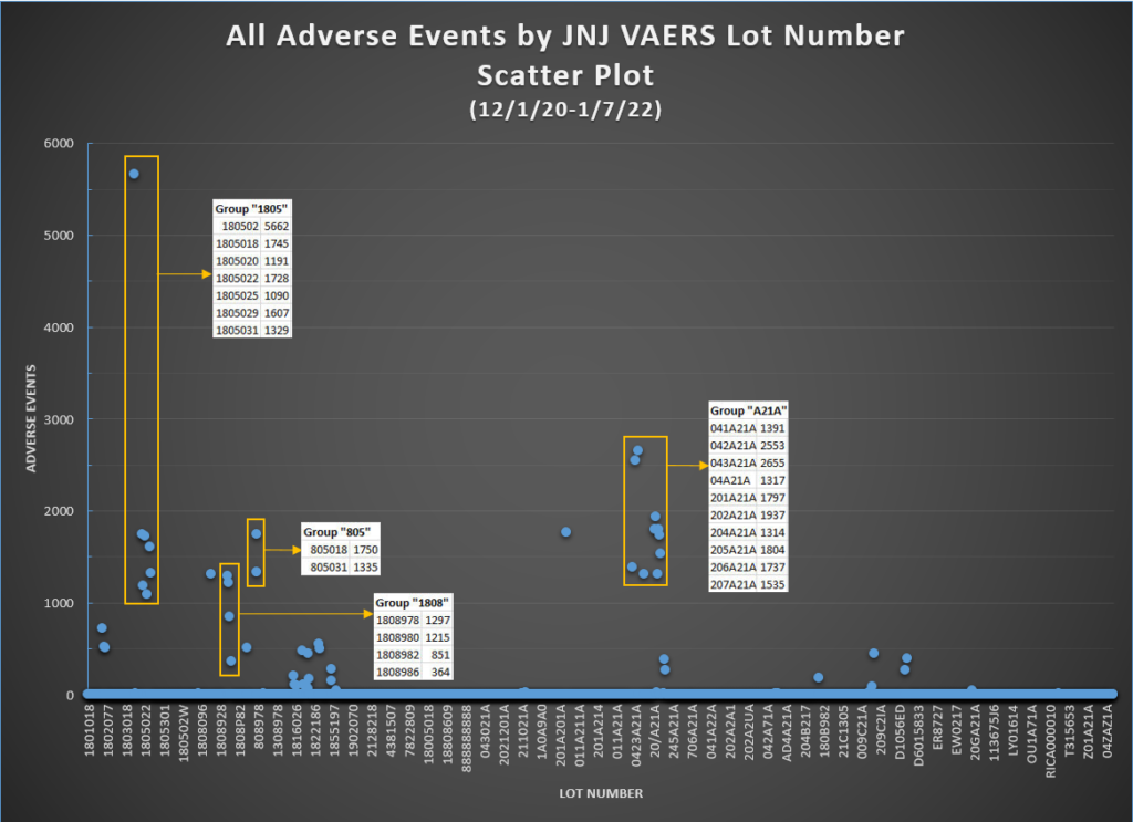
Below, we have another chart showing the same type of thing, but this time including all adverse events, not just deaths. Notice that the patterns are the same as in the previous chart. Harmful lots are “self-organizing” into vertical lines, indicating non-randomness. The EN group has an unbroken sequence of 11 lot numbers (EN6198 – EN6208), and take note how tight the range of adverse events is, from a low of 2286 events to a high of 3124 events. Another interesting thing to note is that while lot number EM0477 is associated with 1944 adverse events, and as such, is not nearly as high as many other points, it is actually the highest point on the previous death chart.

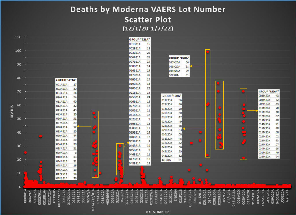
We now repeat the process for the Moderna jab in the chart below. We see in the case of Moderna what appears to be even greater amounts of “self-organization” or non-randomness in the distribution of deaths by lot number. There are several very clear and distinct groupings of events, of which 5 of them are highlighted below.
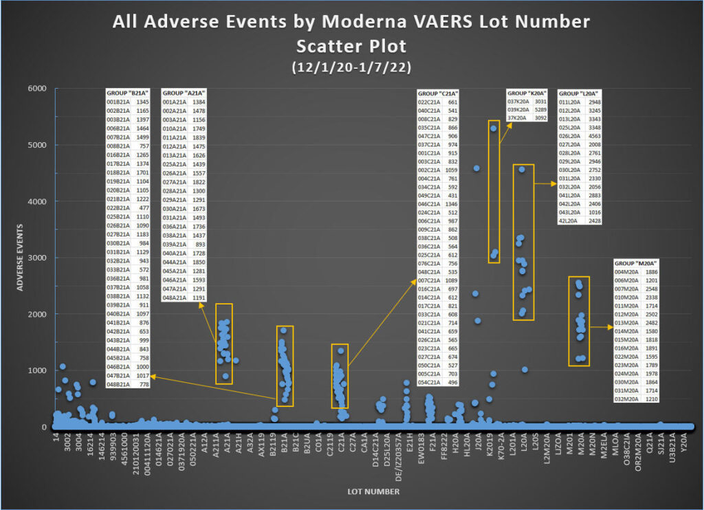
Again we do the same for the Moderna jabs for all adverse events. Not surprisingly, we see the same level of organization as the previous chart. Pay attention also to the vertical gap between the bottom of the three groups highlighted on the rightmost side of the chart and the next point lower. One further sign of the non-randomness of this data is that the drop off in adverse events can be very steep (from 3000 to 1000, or from 2000 to 1000, or from 1200 to 0, each time with nothing in between).
Last but not least, the death chart for the JNJ jabs. Note that Group “805” may very well actually be “1805”, since 805018 and 805031 are not valid lot numbers according to the Janssen Lot Number Expiry Checker, but 1805018 and 1805031 are valid. This discrepancy is simply a reflection of how poorly the CDC is doing quality control on the VAERS data.
What does all this mean? One obvious thing is that this data explains very well why some people take the jabs and experience little or no adverse events (though this is only in the short-term, since we do not know with certainty what these experimental jabs will do in the long-term), while others are harmed, maimed, or even killed. However, the more important takeaway is this: at best, there has been a serious failure in the manufacturing process resulting in inconsistencies and varying levels of toxicity in the batches– very high toxicity in some lots which are associated with serious harm and death, and seemingly low or no toxicity in most other lots. At worst, it implies there is intent by the manufacturers to vary the “magic potion” that is the Covid-19 jabs, whereby some lots are clearly set up with greater propensity for harm than others. All in all, would it not be the rational thing to do to stop these injections so as to investigate these very concerning findings?
What’s the Over/Under in Vegas on the extreme negligence vs. intentional malfeasance question?
This is because of the depopulation Agenda 21/2030 that first Bush announced. In case you have not noticed the genocides happening since the inside job on 9/11/2001 to control our minds with trauma. For me I expect this from our government and find no surprises because nothing is by accident! Culling and soft killing was apart of the plan, hence we have a drug crisis and a they covered everything up with Covid 19 which was funded by our taxes in China through NIH grants to control our minds via trauma induced mind control. They defied basic laws of physics with 9/11 narrative, do not forget this is not about science, our health or saving lives.
We have been under biological warfare since October 2019 funded by our taxes but no one bats a eye or questions the obvious? Who is paying for the “free” tests and “free” “vaccines” (eugenics)? The tax payers are getting billed by the pharma mafia who helped conspire against all of humanity long before the leak or intentional release rather. Event 201 and Clade X is proof they practiced for this all. Plus all the grants in preparation via “gain of function” “research”.
The CladeX simulation (dated Oct 2019 on researchgate) is most likely just as fake as the spars scenario.
The spars scenario dated 2017, yet appears on the jhu website with a date of March 2020.
However, on researchgate, I found various “studies” dated way into the future. For example, “Edaravone… protects mRNA-induced motor neurons..” Dated Dec 2022.
As a side note, I looked up Matthew Schearer, the supposed author of the CladeX paper. He is listed as a senior research associate, with his only accomplishments being is graduation and service in the Navy.
I feel the Occam’s Razor path to take here is to first find out what specific cities/counties/towns/ect. the specific high-event lots were distributed to and then research which racial groups are most prevalent in those areas. It may simply be the case that some racial group is more likely to suffer adverse effects and that yet another one is more likely to have a fatal reaction than it actually resulting from faulty synthesis or alterations to the vaccines at the manufactural source. As much as the US likes to pretend that it’s a “melting pot”, in general racial groups tends to stick together and live in closer proximity to one another than they are to intermingle. Some statistical analysis has already shown that certain racial groups are more prone to serious reactions from COVID than some others are, so it’s not really a huge leap in logic to assume the vaccines may result in similar disparities.
[…] SOURCE – […]