Chart Updated Weekly.
UPDATE 9/24/21: Chart updated below. For you stock traders, the red line now looks like an inverted “Head and Shoulders” pattern. Will this pattern resolve with a red line bounce to the upside?
UPDATE 9/17/21: Chart updated below.
UPDATE 9/10/21: See updated Chart below. Looks like we got a bounce off the bottom on the red Death Line. This indicates the % increase in the number of deaths has increased over the last week or so.
UPDATE 9/3/21: See updated Chart below. Gap continues to widen. Rate of increase of reported VAERS deaths continuing to hit new lows.
UPDATE 8/27/21: See updated Chart below. Rate of daily increase of administered jabs is starting to increase after bottoming out, while rate of increase of reported VAERS deaths is hitting new lows.
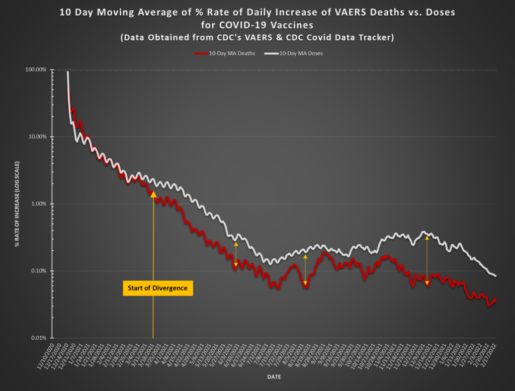
Here is another way to look at the VAERS data for the Covid-19 Vaccines which demonstrates the strong possibility that there is throttling, backlogging, or downright suppression of the death data being reported out of VAERS. Below is a plot of the 10-Day Moving Averages of the Percentage Rate of Daily Increase for the numbers of both the VAERS Deaths and the Vax Doses administered. This chart clearly shows that the rate of increase in the doses being administered clearly outpaces the rate of increase in the number of VAERS deaths. Notice that the strong divergence starts to emerge around 2/25, after which the rate of increase of vax doses being administered continues to stay at a level significantly higher than the rate of increase in deaths being reported in VAERS.
One possibility: Older people were vaccinated first; youngsters were vaccinated later. Vaccine toxicity may be worse for the elderly than for the young.
Yes, that is certainly a possibility…however, the front-line docs, nurses, etc. were being injected at the same time as the elderly. So a more detailed analysis would have to include taking into consideration the # of frontliners and # of elderlies.
VAERS reports don’t require a causal connection so it is likely related to the baseline death rates in each population. It seems unlikely that the vaccine is more toxic to the elderly considering that the most severe effects (which have been much easier to find a causal link for) have been in younger demographics.
It takes half an hour to fill out a report. Most of us just dont have that kind of time. Especially as jabs increase rapidly with the rollout of mandates and Delta fears. Stick them, hope they’re alright, move on to the next. If they have troubles, pass them off to medical care and get back to work. If someone wants to pay for clerks to make the reports great! Otherwise, they arent going to happen 90% of the time.
Yes, I’ve spoken to a traveling nurse who has been all over the country who thinks not even 1% of AEs are being reported.
Yes, what about the MULTIPLE reports shoved into one VAERS ID? We have found several that list “multiple patients” ie., 3,000 patients, 726 patients, 810 patients, 690 patients, 22 patients, etc. Each death is not being fairly counted. The actual number of deaths (in VAERS only, not real life) is closer to 20,000 …and counting!